By: Patrick W. Zimmerman
The question
Are urban and rural America moving away from each other as fast as the current consensus seems to conclude?
The short-short version
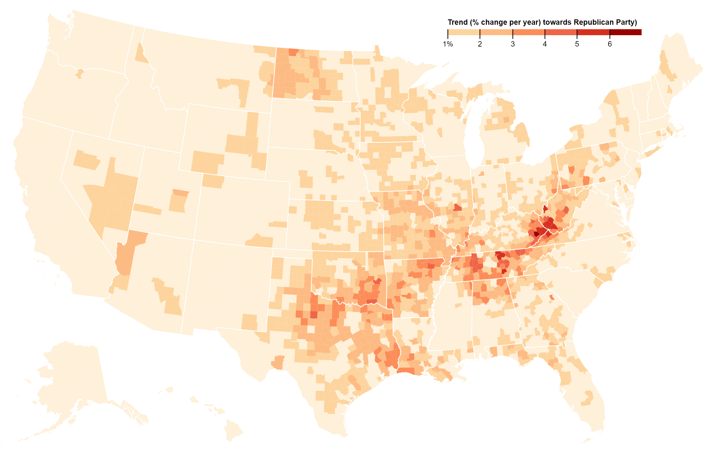
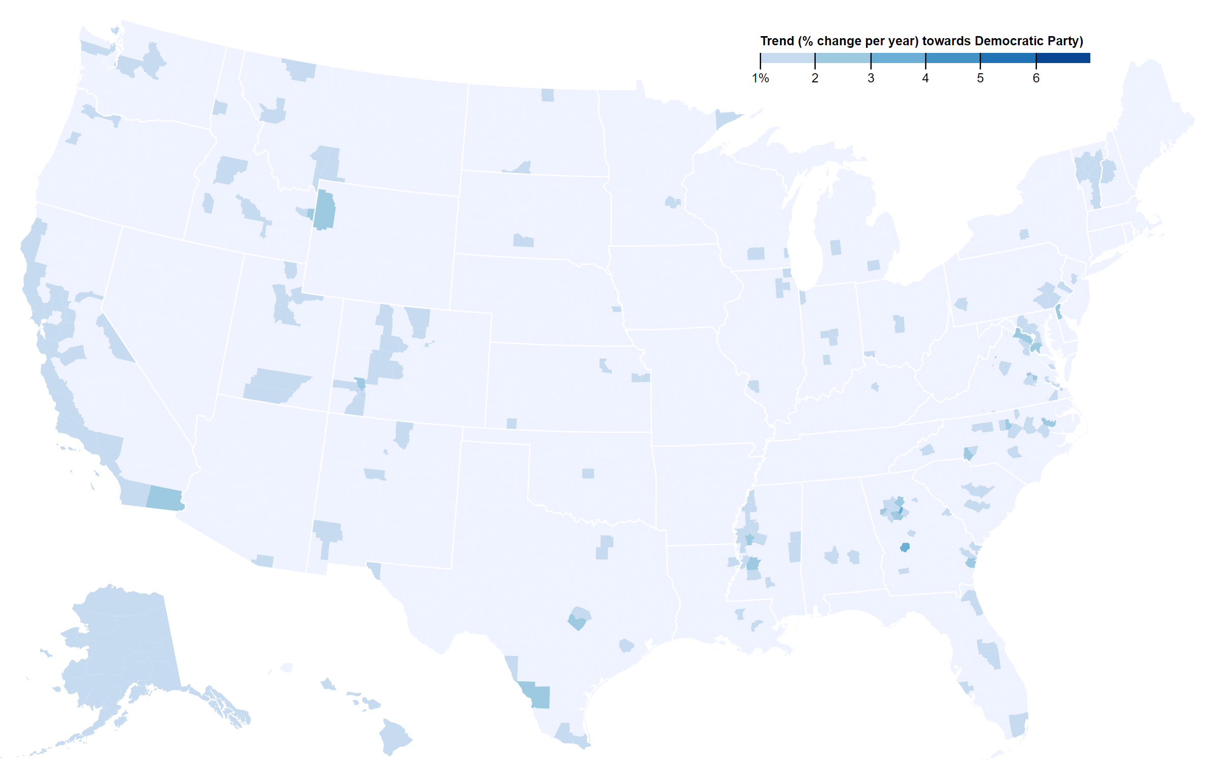
There are way more counties moving towards the Republicans in presidential races, faster, 2328 to 813.1 However, more people live in counties moving towards the Democratic Party.2 So there are more red-moving counties and they are getting redder at about twice the rate as blue-moving counties, but the latter have twice the population.
Also, holy shit that’s a lot of red.

Counties moving towards the Republican Party at >1%/year (full dashboard below)

Counties moving towards the Democratic Party at >1%/year (full dashboard below)
The pilot
As a quick-and-easy-but-imperfect measure of political polarization to see if there’s anything other than the obvious here, I’m just going to look at presidential races since 2000, specifically, the margin of victory between the major parties. For each county, I pulled data from the state Secretaries of State3 and calculated a linear trendline.4 The slope of that line represents the average movement (in percentage points) per year. So, in the maps above, -1% represents presidential results in a given county moving towards the Democratic Party at a rate of 1%/year, +1% is the same for the Republicans.
Note that this is a map of the direction and magnitude of change, not the current results. So a county (i.e. McIntosh County, GA) that has voted GOP in every election since Gore v. Dubya will show as blue because the Republican Party, while still winning, is doing so by less and less. Equally, this measure tends to hide counties that already are extremely partisan (such as San Francisco County, CA or Scott County, NE) because there wasn’t a whole lot of room for the already-leading party to improve. So while Hillary beat Trump by over 75 points in San Francisco in 2016, Kerry also beat Bush by more than 67. Thus, the slope is a relatively unremarkable -0.857 (increasing by 0.857% per year, or a little over 3% per election cycle).
Full map and dashboard.
Scroll or pinch to zoom, hover over counties for details, click tabs for additional views.
Yes, yes. Maps are very pretty. But what does it all meaaaaaannnnnnnnn?
Takeaway 1 – There’s a lot more red in that map, and red counties are moving right faster than blue ones are moving left.
Of the 2328 counties trending towards the Republican Party, the median velocity is 1.14%/year. The 813 moving in the opposite direction have a median slope of only 0.640%/year. So, basically, there isn’t just more red on that map than blue, but it’s also darker. The median point for the country is R+0.773%.
Takeaway 2 – It’s not just the Trump Effect; Appalachia has been rocketing towards the Republicans for some time.
Take Knox County, KY, moving red at a ridiculous rate of 6.38%/year, which works out to a cool 25.52 points per election cycle. Which is insane. What’s even insaner is that Trump actually dampened the rate of change a bit. From 2000-2012, the rate of change of Republican counties is 1.324%. Though, at the same time, Hillary also depressed the rate at with Democratic counties were moving by about the same ~0.2% (0.885%/year vs. 0.640%/year).
Takeaway 3 – We probably should’ve seen the Upper Midwest coming.
Most of the Rust Belt has been moving pretty steadily towards the right for a long time, now. Even some of the urban centers (Chicagoland is a major exception) have been pretty flat, relative to both the original hypothesis and most densely populated areas in the rest of the country. Detroit, Cleveland, and Toledo especially stand out as basically being neutral. Wayne County, Great Source of Clinton Camp Disappointment in 2016 has only moved to the left at a 0.05%/year rate, not remotely compensating for the movement of the rural population towards the Republicans in Michigan.
Takeaway 4 – The West, even the red regions, is surprisingly slowly-to-moderately shifting towards the Democratic Party.
There’s a pretty sharp divide at the Rockies’ eastern edge that breaks the whole map into two areas that almost look like different countries. I did not exactly expect Idaho and Eastern Oregon to be getting (relatively) less Republican.
Takeaway 5 – The strongest area moving to the left is the urban South.
Atlanta, Charlotte, DC, Richmond, and Charleston SC, plus, weirdly, the Mississippi shore of the Mississippi River, are all becoming bluer in a hurry. Metro Atlanta is actually the single Democraticizingest (coined!) area in the US..
Takeaway 6 – A couple reasons for Democrat hope
Although they’re moving left slower, blue-moving counties have twice the population as red ones, 211M to 110M. Taking just set of counties that are moving at a rate of 1% of year or greater, the story is the same, 91M to 43M.
Thus, there are fewer counties moving towards the Democratic Party, more slowly, but they represent far more voters.
So what next?
Well, we’ve got a pretty good sense of what, but, to quote our favorite letter, “Y?”
- As Richard Van Heertum pointed out in the café, the Pew Research Center has a series of longitudinal and Trump-specific studies. That seems like a good next step, right? Right? Done.
- Presidential elections only happen every 4 years, and even if we demarcate Bush v. Gore as a point of inflection in our country’s political climate (there’s also a very good argument to be made for 9/11, as well, but the rough timespan is the same), that’s not a whole lot of samples for each county. The solution? Expand the dataset to include other national races and, possibly, local ones. Congressional and Senatorial returns should definitely help make the necessarily simplistic look above more meaningful, as a start.
- Was Bush v. Gore really a major watershed in how people viewed each party? Speaking of water, we could try extending this back to Watergate. Or FDR.
- Correlations, correlations, correlations. How much does this rate of change match up with changing median income? Unemployement levels? Ethnic and demographic change (or the perception of it)?
What do you think? Drop a suggestion either in the comments below or in the café!
1 Alaska’s Division of Elections, just to be different does not post county-level results, so all 29 Alaskan Census Areas just show the state’s overall voting returns.^
2 2015 estimates pulled from the US Census Bureau.^
3 A.k.a. Departments of Elections, Divisions of Elections, et. al. The official election canvasses from each state.^
4 Even just presidential returns at the county level were shockingly a pain in the ass to get hold of. There is no national FEC database at the county level (just state), or even a private one for anything older than 2008, so I had to go state-to-state. For some states, you downloaded a nice, sortable .csv file or tab-separated text. For others (I’m looking at you, Indiana), you had to take an OCR of a ridiculously bad quality .pdf, convert to a spreadsheet, then debug a several-thousand row file. Indiana apparently had an intern go to the state library and scan a paper image at a slight tilt. I’m not used to a timestamp on a digital file for a 21st century event being a literal stamp.^
No Comments on "Partisanship in 21st-century America: How fast are voters moving away from each other?"